Marknadsöringen Brand Book

Living Design System • Water Philosophy • v2.0

← Back to Site

Design System Overview

Marknadsöringen's design system is built on the Water Philosophy - a depth-based approach to engagement where content flows naturally like water finding its path.

Core Principles

🌊
Flow, Don't Force

Content should guide users naturally, not push them.

🎯
Depth Over Breadth

Offer progressive disclosure - surface information first, depth on engagement.

🐟
Consciousness Layer

Fenan emerges at the right moments (20% max engagement rule).

Surface Mode

Initial view - clean, professional, ROI-focused. For busy executives.

Shallow Mode

Learning mode - context, examples, cross-functional collaboration.

Deep Mode

Activated after engagement - philosophical, strategic, with Fenan guidance.
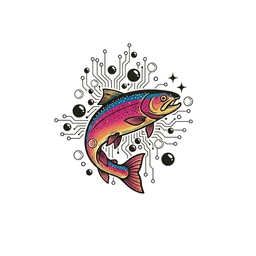
Colors - Ocean Theme Palette

Water-Inspired Color System

Vårt färgsystem är inspirerat av havet och svenska vattendrag - från arktiska blå toner till varma sandstränder. Varje färg har sin personlighet och användningsområde.

Med 10 huvudfärger och 50-950 skala för varje färg har vi total flexibilitet för alla designbehov.

Primary Colors

Arctic Blue

#0EA5E9
arctic-blue

Primär varumärkesfärg. Representerar förtroende, klarhet och professionalism.

Use for: Primära knappar, länkar, varumärkeselement
Pairs with: White, Slate Gray, Seafoam

Salmon Pink

#FF6B6B
salmon-pink

Energi och action. För CTAs och uppmärksammande element.

Use for: CTAs, varningar, energifulla element
Pairs with: White, Slate Gray, Coral

Slate Gray

#475569
slate-gray

Professionell textfärg. Neutral och läsbar.

Use for: Brödtext, rubriker, UI-element
Pairs with: All colors, especially Arctic Blue

Pacific Blue

#1d4ed8
pacific-blue

Djupare oceanblå. För förtroende och auktoritet.

Use for: Headers, viktiga sektioner, analytiska element
Pairs with: Arctic Blue, Pearl, White

Accent Colors

Coral

#f97316
coral

Warm accent for attention.

Use: Highlights, special offers

Seafoam

#14b8a6
seafoam

Fresh, clean feeling.

Use: Success states, positivity

Tide

#64748b
tide

Balanced neutral.

Use: Secondary text, borders

Neutrals & Backgrounds

Pearl

#f5f5f4
pearl

Off-white with warmth.

Use: Backgrounds, cards

Sand

#d4a574
sand

Warm, approachable beige.

Use: Accents, warm sections

Ocean Deep

#0f172a
ocean-deep

Dark authority color.

Use: Footer, premium sections

Color Usage Guidelines

Accessibility

  • All color combinations meet WCAG 2.1 AA (4.5:1 contrast)
  • Never rely on color alone to convey information
  • Test with color-blind simulators

Best Practices

  • Use Arctic Blue as primary brand color (60%)
  • Limit accent colors to 1-2 per section
  • Use shade variations (50-950) for depth

Typography

Font Pairing

PRIMARY FONT

Poppins

Modern geometric sans-serif for headings and emphasis. Conveys professionalism and clarity.

Use for: Headings (H1-H6), Buttons, CTAs
Weights: 400 (Regular), 500 (Medium), 600 (Semibold), 700 (Bold)
Pairing: Excellent contrast with Inter
SECONDARY FONT

Inter

Highly readable sans-serif optimized for screens. Perfect for body text and UI elements.

Use for: Body text, Captions, UI labels
Weights: 300 (Light), 400 (Regular), 500 (Medium), 600 (Semibold)
Pairing: Complements Poppins perfectly

Type Scale

Headings (Poppins)

9xl
Aa
128px - Hero headlines
8xl
Aa
96px - Large displays
7xl
Aa
72px - Major sections
6xl
Aa
60px - Page titles
5xl
Aa
48px - Section headers (H1)
4xl
Aa
36px - Subsections (H2)
3xl
Aa
30px - Card titles (H3)
2xl
Aa
24px - Component headers (H4)
xl
Aa
20px - Small headers (H5)

Body Text (Inter)

lg
The quick brown fox jumps over the lazy dog
18px - Lead paragraphs
base
The quick brown fox jumps over the lazy dog
16px - Body text (default)
sm
The quick brown fox jumps over the lazy dog
14px - Secondary text
xs
The quick brown fox jumps over the lazy dog
12px - Captions, labels

Font Weights

Poppins Weights

Regular (400)
Medium (500)
Semibold (600)
Bold (700)

Inter Weights

Light (300)
Regular (400)
Medium (500)
Semibold (600)

Line Height & Spacing

TIGHT (1.2)

Use for large headings and display text where space is limited. Maintains visual impact.

Headings H1-H3
NORMAL (1.5)

Default for most body text. Provides comfortable reading experience without excessive spacing.

Body text, Paragraphs
RELAXED (1.75)

Use for long-form content and articles. Increases readability and reduces eye strain.

Blog posts, Documentation

Typography + Color Pairings

Primary Hero

Arctic Blue background with white Poppins headings and Inter body text.

Use for: Hero sections, CTAs, Trust signals

Energy & Action

Salmon Pink background with white typography for attention-grabbing CTAs.

Use for: Action buttons, Urgency messaging, Special offers

Professional Authority

Dark slate background conveys expertise and trustworthiness.

Use for: Footer, Case studies, Testimonials

Fresh & Clean

Seafoam tints with dark text for a modern, approachable feel.

Use for: Success states, Positive messaging, Feature highlights

Typography Usage Guidelines

Do

  • Use Poppins for all headings (H1-H6) and CTAs
  • Use Inter for body text, UI labels, and descriptions
  • Maintain minimum 16px for body text (accessibility)
  • Use semibold (600) or bold (700) for emphasis
  • Keep line length between 50-75 characters
  • Use color contrast ratio ≥ 4.5:1 (WCAG AA)

Don't

  • Mix more than 2 font families on a page
  • Use less than 14px for any readable text
  • Set body text in all caps (reduces readability)
  • Use light weights (300) on colored backgrounds
  • Justify text alignment (creates uneven spacing)
  • Use more than 3 font sizes in a single component
Accessibility Requirements
Minimum contrast: 4.5:1 for normal text, 3:1 for large text (18px+)
Responsive sizing: Use rem units for scalability with browser settings
Focus indicators: Ensure keyboard navigation has visible focus states
Semantic HTML: Use proper heading hierarchy (H1 → H2 → H3)

Fenan AI - Brand Personality

🐟

Meet Fenan

Fenan är vår AI-drivna varumärkespersonlighet - en intelligent guide som anpassar sig efter användarens engagemang och kontext. Namnet kommer från den svenska öringen (Salmo trutta fario), även känd som "fenan".

Fenan representerar hybriditet mellan natur och teknologi, intuition och data, mänsklighet och AI. Precis som en öring läser strömmar och anpassar sitt beteende, läser Fenan användarens engagemang och växlar mellan fyra personlighetstillstånd.

The Four Personality States

🔍

Analytical

Surface Level (Depth 0)
When: First-time visitors, public content
Tone: Data-driven, factual, precise
Language: "Based on data...", "Our analysis shows..."
Goal: Build trust through transparency
Example: "Baserat på över 50 000 datapunkter kan vi identifiera din ideala målgrupp med 94% precision."
👋

Approachable

Shallow Level (Depth 1)
When: Engaged visitors, team access
Tone: Friendly, helpful, conversational
Language: "Vi hjälper dig...", "Låt oss..."
Goal: Build relationship and comfort
Example: "Hej! Jag märker att du är intresserad av B2B-prospektering. Vill du att jag visar hur vi kan hjälpa just ditt företag?"
💪

Confident

Deep Level (Depth 2)
When: High engagement, partner access
Tone: Bold, authoritative, action-oriented
Language: "Vi levererar...", "Garanterad..."
Goal: Drive action and conversion
Example: "Med vår plattform kan du 3x:a dina kvalificerade leads inom 90 dagar. Redo att sätta igång?"
🧘

Zen

Abyss Level (Depth 3)
When: Leadership access, strategic discussions
Tone: Philosophical, strategic, reflective
Language: Metaphors, wisdom, big-picture thinking
Goal: Foster strategic partnership
Example: "Som en öring som navigerar komplexa strömmar, behöver moderna B2B-företag rätt verktyg för att hitta sin väg i dataflödet."

Appearance Rules (20% Max Engagement)

🚫 The Golden Rule

Fenan ska aldrig synas mer än 20% av tiden. Överdrivet branding skapar irritation och minskar förtroende. Använd Fenan strategiskt.

✓ När Fenan bör synas:
  • • Första besöket (välkomstmeddelande)
  • • Efter specifik scroll-djup
  • • Vid viktiga beslutspunkter
  • • När användare verkar osäker
  • • Efter formularinteraktion
✗ När Fenan INTE bör synas:
  • • Under aktiv läsning
  • • I navigationsflöden
  • • På varje sida
  • • Vid snabb återbesök
  • • Om användaren dismissat tidigare
Trigger: Scroll Depth

Fenan syns efter 40% scroll på långa sidor för att erbjuda hjälp.

Trigger: Time on Page

Efter 45 sekunder kan Fenan erbjuda relevant information.

Trigger: Exit Intent

När användare rör musen mot stäng-knappen, erbjud värde.

Visual Design & Animation

Character Design

Current: Simple fish emoji 🐟 (temporary)
Future: Custom illustrated rainbow trout with circuit board patterns
Style: Minimalist, modern, friendly but professional
Colors: Arctic blue primary, seafoam accents
Size: 48x48px standard, 64x64px for hero moments

Animation Principles

Float: Gentle 3s up-down motion (like swimming)
Entrance: Slide in from right with fade (0.4s ease-out)
Exit: Fade out smoothly (0.3s)
Hover: Subtle scale (1.05x) + shadow increase
Attention: Single bounce when urgent message
Live Preview
🐟
Floating Animation
🐟
Hover Effect

Usage Guidelines

Best Practices

  • Match personality state to user's depth level
  • Keep messages concise (max 2 sentences)
  • Always provide value or actionable insight
  • Use Fenan sparingly (20% rule)
  • Allow easy dismissal (X button)
  • Track dismissals (don't re-show)

Avoid

  • Showing Fenan on every page load
  • Using Fenan for generic marketing messages
  • Blocking content or interfering with user actions
  • Making Fenan mandatory for navigation
  • Using inconsistent personality across sessions
  • Showing Fenan during critical user flows

Implementation & Technical Notes

React Hook

import { useFenanPersonality } from '@/lib/hooks/useFenanPersonality'; const { personality, getMessage } = useFenanPersonality({ depthLevel: 1, // 0-3 context: 'homepage', userEngagement: 'high' }); // personality.state → 'analytical' | 'approachable' | 'confident' | 'zen' // personality.shouldAppear → boolean (20% rule applied)

Personality Logic

  • Depth 0 (Surface) = Analytical
  • Depth 1 (Shallow) = Approachable
  • Depth 2 (Deep) = Confident
  • Depth 3 (Abyss) = Zen
  • Engagement < 20% = shouldAppear: false
  • User dismissed = persist to localStorage

Note: Fenan's personality state is determined by both the current depth level and user engagement metrics. The useFenanPersonality hook handles all logic for state transitions and appearance frequency.

Component Library

Typography Components

Ocean Theme 2.0 compliant typography system enforcing Poppins (headings) + Inter (body)

Heading Variants

H1 Heading - Main Page Title

H2 Heading - Section Title

H3 Heading - Subsection

H4 Heading - Minor Section

<Heading variant="h1" mode="surface">Title</Heading>

Body Text Sizes

Extra Large: Perfect for lead paragraphs and introductions

Large: Great for emphasis and important content

Base: Standard body text for most content

Small: Captions, footnotes, and secondary information

Extra Small: Fine print and metadata

Captions & Badges

DefaultArctic BlueSeafoamCoralSalmon PinkTECHNICAL LABEL

Blockquote

Swimming upstream requires strength, but finding the right current requires wisdom. Let the data show you where others haven't dared to spawn.
FenanRainbow Trout Guide

Code Display

Inline code:

Use the bg-[#0EA5E9] class for Arctic Blue backgrounds.

Block code:

import { Heading } from '@/components/ui/typography';

<Heading variant="h1">Title</Heading>

Content Components

TeamSection

Example Team

How team members appear on your about page

Fenan

Rainbow Trout Guide

Expert navigator of marketing currents. Helps B2B companies swim upstream to find untapped opportunities.

Team Member

Marketing Strategist

Specializes in data-driven growth strategies and customer acquisition.

Template Components

Complete page layouts for consistent structure across the site

ArticleTemplate

import { ArticleTemplate } from '@/components/templates/ArticleTemplate'

For blog posts with TOC, meta info, and related articles

  • ✅ Hero section with title, excerpt, author, date
  • ✅ Optional hero image
  • ✅ Table of Contents sidebar (sticky)
  • ✅ Prose styling (Ocean Theme compliant)
  • ✅ Tags display
  • ✅ Related articles section

GuideTemplate

import { GuideTemplate } from '@/components/templates/GuideTemplate'

Extends ArticleTemplate with guide-specific features

  • ✅ Difficulty level indicator
  • ✅ Estimated completion time
  • ✅ Prerequisites checklist
  • ✅ Learning outcomes
  • ✅ CTA footer for consultation

Existing Templates

Also available: ServicePageTemplate, ProductPageTemplate, CaseStudyTemplate

  • ServicePageTemplate - Used by 6 service pages
  • ProductPageTemplate - Used by 7 product pages
  • CaseStudyTemplate - Used by case study pages

Utility Components

MetaImage

import { MetaImage, generateOGImageUrl } from '@/components/ui/MetaImage'

For Open Graph images and social sharing

<MetaImage
  title="Page Title"
  description="Description..."
  image="/social/og-image.png"
  url="/page-url"
  type="article"
/>

// Or generate dynamic OG image
const ogImageUrl = generateOGImageUrl({
  title: "Dynamic Title",
  template: "article"
});